Character Development: A story about subtitles, cinema, and the Satos
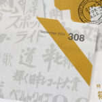
2022年9月に発行されたtypographics t誌303号内では、「映る文字」の特集が掲載しました。このエッセイの作者Dan Vaughanさんの希望として、シネマフォントの歴史が世界中に広がるため記事の元である英語版がtypographics tオンラインで掲載されることでした。
Foreword: Duncan Brotherton
Editor in chief | typographics t
I have been involved in typographics t for two years now. Despite them both being during my yakudoshi years (a 3-year period of bad luck that occurs at certain ages, believed by the Japanese), all of these opportunities I have been presented with to feature great content in the magazine has me feeling like some local god is watching over me.
In the summer of 2021, Ian Lynam (featured in issue 300’s Global Type Relay article) contacted me wanting to introduce a friend who was researching Japanese fonts. Ian’s line of thought was that I—being a board member of the JTA—would be able to help. What I was NOT expecting, was a foreigner to contact me. I mean, why would a foreigner be interested in the history of a very specific, largely unknown typeface? I didn’t expect there to be other type nerds out there like myself.
Like myself, Dan Vaughan is an Australian graphic designer living in Japan. He is based in Tokyo and at the time was wanting to research about a typeface called Cinema Font. He had first seen it in the subtitles of a movie somewhere and wanted to contact the Japan Typography Association to see if he could find out more.
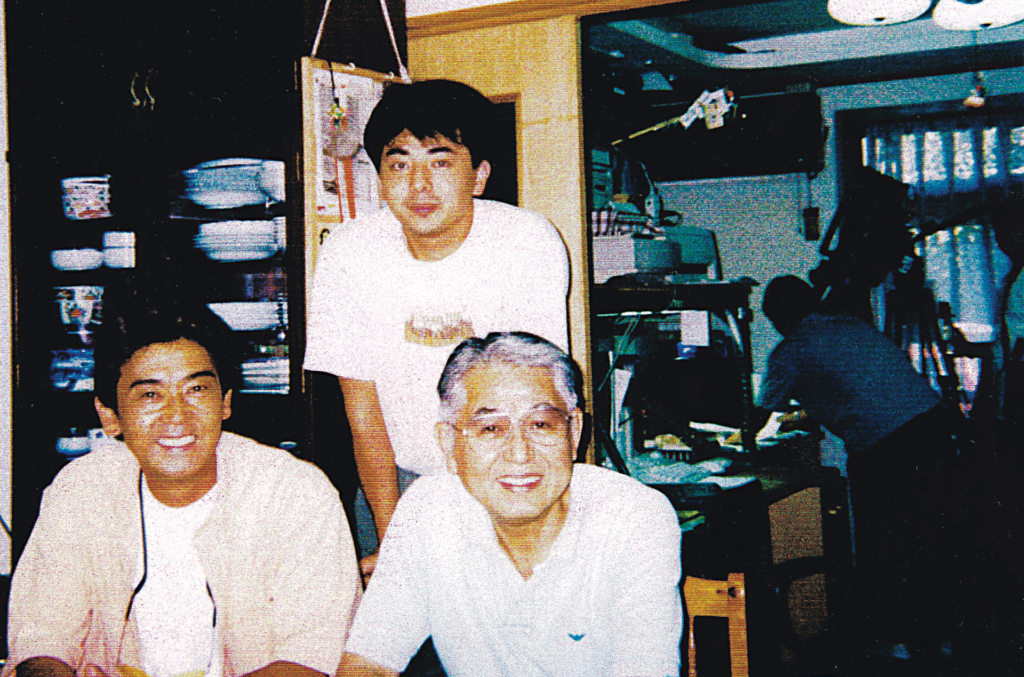
The topic was raised at our next board meeting, and shortly after a JTA member, Mr. Osaki, recommended that we contact Fontworks (one of the associations corporate members). Part of their font range includes the typeface New Cinema, which was created by Hideo Sato (the creator of the original Cinema Font). We were informed that he had already passed away, but he recommended we try to contact Fontworks anyway. I got in contact immediately, and was promptly introduced to Takeshi Sato, Hideo Sato’s son. Dan and I then arranged to meet Takeshi and his wife Akiko Sato on Zoom, and I helped interpret the interview for Dan.
After the interview, which provided plenty of interesting information, I asked Dan where he was planning to publish his research. He said he hadn’t decided. After an offer, it was agreed that we would publish the Japanese edition in typographics t and the original English research here, online.
What we have here is the result of an Australian designer in Tokyo proactively researching unique Japanese typeface he is interested in, and an Australian designer in Kyoto helping to interpret the interview, translate the manuscript, and publish it for a niche audience of Japanese typography lovers. In other words; an international cast has been discovering, documenting and archiving the history of Japanese typography, in Japanese. It certainly makes me smile and wonder what on earth is going on.
The JTA is very fortunate to be able to archive a valuable part of Japanese typography history in typographics t, and I would like to take the oppoutunity to thank Dan for his help.
Thanks Dan; good onya mate.
Character Development, A story about subtitles, cinema, and the Satos
Originally published as 「映る文字 シネマフォントの歴史」in typographics t, edition 303, published in September, 2022
Text: Dan Vaughan
One of my early experiences in Japan was going to see a film at a local theater in Kichijoji in 2015. It was screened in the original English language, with subtitles in Japanese. The experience was particularly memorable, not for the film itself, but because despite understanding Japanese, I could barely read the subtitles. As an Australian designer relatively new to Japan, the typeface used for the subtitles was something I had never seen before. Characters were in shapes that I didn’t recognise, and the rhythm of uneven character-heights that I had become accustomed to had been replaced with a rigid uniformity. What was to me a confronting experience, I later learned, was the complete opposite for most Japanese.
The idiosyncratic subtitle lettering style is part of a genre of Japanese type called cinema moji (not to be confused with Shinkichi Yamada’s kinema moji). The style emerged over eighty years ago, alongside the introduction of foreign talkies (non-silent films) in Japan, and until the early 2000’s was drawn entirely by hand by professional letterers. Now, subtitles are applied digitally, but the style is still prevalent because of its cultural and technical significance.
Because of their unique characteristics, cinema moji occupy a definitive space in the Japanese type landscape, but the nature of their traditional production and obscurity meant that this was almost not the case. Understanding the precarity of cinema moji requires a knowledge of their cultural and technological history. Importantly, we must acknowledge the contributions of two individuals in particular – Sato Hideo, who wrote subtitles by hand for more than fifty years, and his son Takeshi, who created the first cinema moji font, Cinema Font, from his father’s lettering.
Cinema Font represents not only the defining entry in the cinema moji genre, but is also an artifact of a lost craft, and Takeshi’s attempt to preserve the legacy of his father’s work. The subtitle style once lived alongside film, and developed in response to cultural and technological advancements. But while it no longer has the opportunity to evolve in the same way, its enduring popularity and relationship to film ensures that as long as we remember why it existed and where it came from, cinema moji has a future.
The beginning of Japanese subtitles
Prior to the advent of subtitles in the early 20th century, foreign films screened in Japan were either dubbed over by Japanese actors, or were narrated in real time by performers called ‘benshi’. In most cases, both local and foreign films also contained ‘intertitles’; frames with handwritten or printed text that were inserted into a film to convey dialogue or exposition. When a film was narrated, benshi would read the intertitles aloud, but were otherwise intended to be read by the audience.
Intertitles can be considered a kind of precursor to subtitles, but their role and appearance were fundamentally different. While they were both used to convey dialogue, intertitles were also a narrative device, and often became part of the film’s mise-en-scene. Intertitles were written expressively and decoratively, and unlike conventional subtitles, the style of their lettering was chosen to match the film they appeared in. The shift to subtitles introduced a new approach to the use of text in Japanese film; where intertitles were designed to be noticed, subtitles aimed for something closer to invisibility.
The beginning of this shift occurred when the US studio Paramount asked Tamura Yukihiko, the editor for film journal Kinema Junpo, to translate their new film Morocco and oversee the production of its subtitles in 1931. Despite the popularity of foreign films in Japan, Paramount and other Hollywood studios had struggled to captivate Japanese audiences with a reliable localisation method. Dubbing was unpopular because of the experienced disconnect between the Western characters on screen coupled with Japanese voices, and also because early film dubs had used performers with a strong Hiroshima dialect that audiences had trouble getting into. Subtitles had already been popular in Europe, and were cheaper and easier to produce than arranging for benshi to narrate every screening, so Paramount saw Morocco as an opportunity to test this new method with Japanese audiences.
The technology required for subtitling was novel at the time and not yet available in Japan, so Tamura traveled to New York. Tamura was neither an artist nor technician, so looked for Japanese letterers to write the subtitles locally, but being so far from Japan struggled to find suitable talent. At the last minute however, he found two capable applicants: Hayakawa, and Yamamoto (their full names are regrettably unknown).
Tamura’s only known instruction to Hayakawa and Yamamoto was simply to create lettering that, to him, was artistically beautiful. We can draw comparisons however between Hayakawa and Yamamoto’s lettering and the styles of text used in intertitles in American and European films in the same period. Most of these intertitles were relatively simpler than the lettering used in Japanese intertitles, and were written with round-nibbed ‘speedball’ pens that gave a softer impression than traditional Japanese brushes.
Perhaps more importantly, Tamura was primarily concerned with the overall audience experience of the subtitles. After performing his translation, he found that the length of many of his subtitles had to be edited down to prevent them from rolling over into following scenes. He also thought that reading subtitles in Japanese horizontally was difficult, so he set them vertically, but then had to position them with extra care to avoid covering important elements of the film. The simplification of the lettering was part of an attempt to make the consumption of subtitles easier and faster for viewers.
Despite the trio’s efforts, there were a number of issues with the final subtitles. The length of the translation and size of the characters obstructed the film’s action, and often they disappeared before viewers could read them fully. Importantly, critics noted how unrefined the lettering was, and wished that the writing had been more beautiful. Characters with more complex components lost their fidelity when projected, and smaller strokes often disappeared or melded into undesirable blobs, giving the production an amateurish feel.
General audiences, however, were captivated by Morocco’s subtitles. Paramount saw the project as a success, and decided to subtitle all of its following releases in Japan. Tamura was asked to continue subtitling in New York but could not leave Japan permanently. Instead, his protege Shimizu Shunji took over, who established subtitling as a true profession, and became Japan’s first official subtitler. Whether or not Hayakawa and Yamamoto continued lettering subtitles beyond Morocco is unknown.
In the following years, Paramount moved its subtitling operations to Kyoto. There, Shimizu developed more concrete conventions for how subtitles should be written, and advocated the concept that subtitles should be ‘neutral’, an idea with its roots in Tamura’s initial attempts to simplify them in Morocco. The letterers responsible for physically rendering the subtitles, now referred to as ‘title writers’, abandoned the decorative and expressive calligraphy seen in intertitles for a more discreet style of writing that built upon the original titles by Hayakawa and Yamamoto.
The development of early cinema moji continued until 1941, when film imports were halted at the beginning of World War 2. Shimizu, now without subtitling work, moved into publishing. He returned to subtitling ten years later, when imports resumed. Around the same time, a young interpreter who had worked in film localisation under the Allied Occupation, and a friend of Shimizu’s, Takase Shizuo, founded the Tokyo-based Central Production Pool (CPP). At CPP the practice of title writing continued to evolve, and under Takase’s nephew, Sato Hideo, it was developed into the contemporary cinema moji style still in use today.
The title writer, Sato Hideo
Sato Hideo spent most of his life in relative obscurity, but was a uniquely important figure in Japanese film culture for his role as a title writer. The cinema moji style as it appears today is largely based on the subtitles he wrote by hand, and the original cinema moji typeface, Cinema Font, was developed from samples of his lettering by his son Takeshi.
Sato was born in 1938 in Minato-ku, Tokyo, and lived with his uncle Takase Shizuo as a teenager while CPP was in its early years. Having a regular window to his uncle’s work, Sato too developed an interest in working in film. He initially approached Takase to apprentice as a translator, but that department at CPP was already full. Knowing that Sato had some experience with point-of-sale lettering and calligraphy however, Takase offered him an apprentice position in the title writing office instead.
Sato developed his writing skills under Ooi Makoto and Takagu Hideo. He picked up his craft quickly; enough so that when Makoto became ill in the late 50s, Sato was able to take over for him in full capacity. The postwar economic boom and the rescinding of foreign film bans meant that Sato was in-demand as a title writer through to the 70’s, as audiences demanded more films from overseas. Although the peak of his career occurred in the 80’s, the use of hand-drawn subtitles began to decline as the use of laser phototype technology became more convenient and affordable, gradually undermining the need for title writers.
Sato’s son Takeshi, at this point a software engineer at Hitachi, noticed his father’s work opportunities decreasing, and thought that if he were to make a digital font of his lettering, it would give his father a new advantage in the face of an irreversible technological shift. Takeshi began work on the typeface ‘Cinema Font’ in the mid 90s. As Cinema Font was being developed, Sato continued to write subtitles by hand in at least some capacity. The last film he wrote entirely by hand was, fittingly perhaps, Titanic in 1997. Cinema Font never entirely replaced the need for Sato’s handwritten work, and he garnered attention for the unusual subtitles he drew for the Harry Potter films from 2002–2011. These subtitles drew the attention of Fontworks, who partnered with Sato and his son to release New Cinema – a two-font typeface that in many ways would become a successor to Cinema Font. New Cinema was published in the mid-2000s and contributed to the late awareness of Sato’s work before his passing in 2013.
That we know so much about the life and work of Sato is uncommonly fortunate. As Cinema Font was the first font of its kind at the time, its production put Sato in the spotlight, but in the forty years he had been working until then, very few people outside of his circle of work would have even known his name, let alone that his profession existed. Title writers, much like other technicians involved in the subtitle development process, were never acknowledged in a film’s credits — a convention that started with Hayakawa and Yamamoto, and the title writers who worked under Shimizu Shunji, and remained a convention until title writers were replaced by digital typesetting.
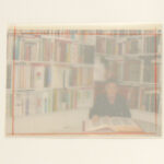
Cinema Font and New Cinema are in part a legacy of his life and work, but in a broader way they serve as artifacts of both Japanese cinema and type design. In the time of handwritten subtitles, original copies of the lettering were never kept after they had been printed on film, and when a film was later republished (i.e on DVD), the subtitles would be redrawn in an unrelated style, or typeset with laser or phototype technology. This meant that the original subtitle lettering could only be seen when a film was projected from its filmstrip, and was therefore often never seen again after theatrical screenings. Further, many of these filmstrips no longer exist — they were destroyed in the National Film Center fire of 1984. The remaining samples of Sato’s work have survived thanks to Takeshi and his wife Akiko. After Sato died, they visited all of the past studios that their father worked for, and gathered any of the cards and plates that just happened to have not been discarded.
Sato’s work was seemingly unremarkable, but was integral in defining a typographic genre and securing an important part of Japanese type design history. Although there were several title writers working during his time, the contemporary cinema moji style is derived mostly from his lettering and the original Cinema Font. The decisions he made regarding his personal lettering have defined a style that was once shaped by technology and the times, but is now frozen in place, and the Shōwa-era nostalgia and cinematic charm that cinema moji represent are inextricably linked to Sato himself.
The Cinema Moji Style
Sato’s style of lettering, the basis for cinema moji, is the result of an attempt to improve upon the work of his predecessors, while navigating an industry prone to technological change. Sato was not in the traditional sense a designer, but he approached his craft with a degree of consideration that revealed the compassion he held for the people who consumed it. The most important qualities that Sato strove for in his lettering were, conflictingly, legibility and invisibility; he wanted audiences to read his lettering with ease, without realizing they were doing so. The volatility of the technology used in creating subtitles meant that Sato was constantly adapting his style to new conditions, but ultimately these technical constraints bore innovations that are, today, integral to the cinema moji style.
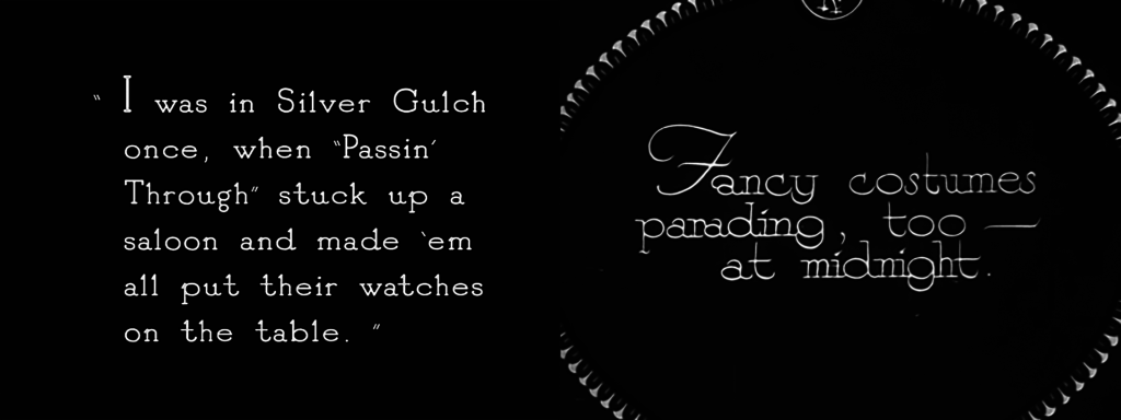
Cinema moji occupy an odd position in the Japanese type design canon. They do not fit neatly into traditional gothic or mincho classifications, but have a clear set of requirements that prevent them from being shuffled into a catch-all ‘decorative’ category. The identifiable qualities of cinema moji can be broken down into the following elements: uniform stroke widths, exaggerated counterspaces and tomé (stroke endings), the use of ryakuji (abbreviated characters), the use of ‘airholes’, and non-traditional character alignments. Many of these characteristics eschew Japanese type conventions, while others simply reinterpret them. All of them, however, are the product of efforts to write effective subtitles while mitigating the pressure of technological restraints.
Prior to 1938, subtitles were made in the same fashion as intertitles; they were drawn on card with a brush and photographed, and the negative was developed into the movie’s filmstrip. What differed was their purpose; intertitles were meant to be expressive, while subtitles were meant to be ‘neutral’. One of the first methods to achieve less expressive lettering was to simplify their brushstrokes, influenced by the lettering of intertitles in American films from the late 1920’s and early 1930’s.
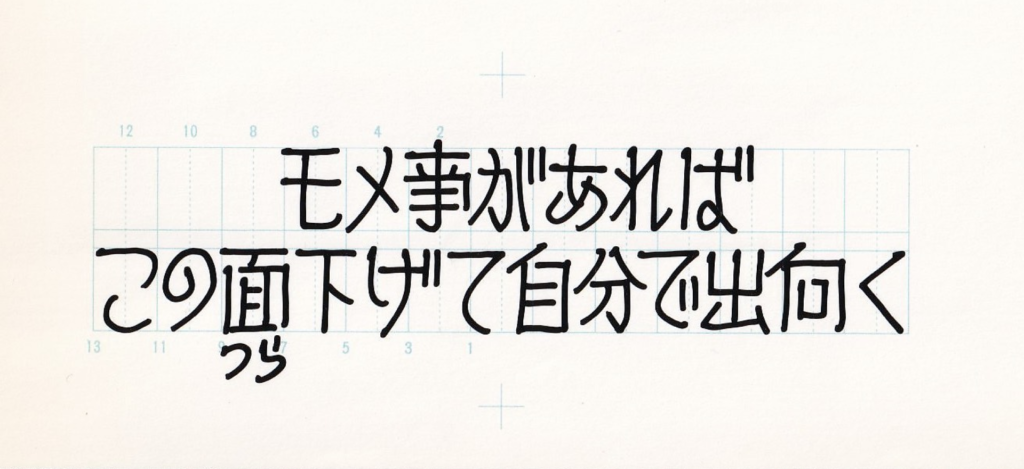
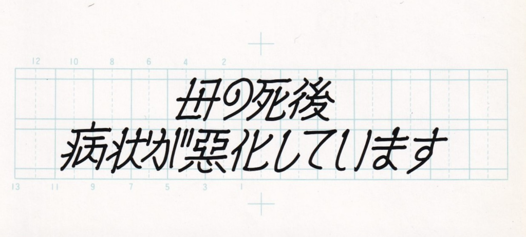
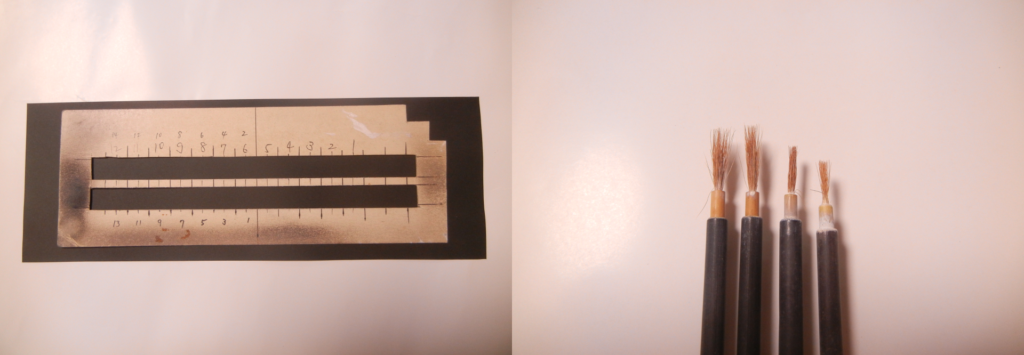
To achieve a more uniform stroke width for subtitles, title writers would trim the tips of the brush, then solder them together to make a flat ‘nib’. This process came with caveats; the tip would fray over time, meaning that the lettering would degrade as more cards were drawn. No two brushes would ever have the exact same width, so a brush could not be easily replaced mid-job. Writers aimed to write their subtitles in the order they appeared on screen, so the gradual degradation would not be noticeable to audiences. If cards were drawn in any other order, the quality of the lettering would frequently change throughout the film. To Sato, this was potentially disastrous. If audiences became aware of the fact they were reading subtitles, rather than it being a subconscious activity, Sato considered the titles a failure, and on occasions where he replaced other writers mid-job always adjusted his own lettering to match the style of the previous writer.
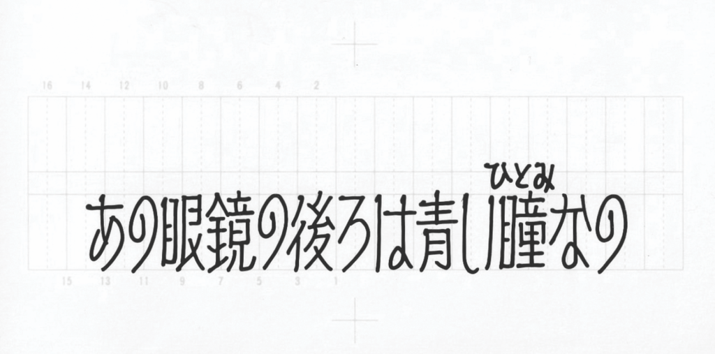
The simplification of characters was also an attempt to make subtitles more legible. Since Morocco, studios had been under pressure to ensure their titles didn’t degenerate into white blobs when projected on screen. Over time technological advances allowed for more definition, and title writers took advantage of this by making their character design more distinctive, with the aim of making them more distinguishable at small sizes. Sato’s lettering built upon these evolutions and established an overall ‘look’ that defines the genre today. For hiragana and katakana, Sato pushed characters to their extreme, opening up counterspaces and exaggerating their skeleton and silhouette, while replicating traditional brushstrokes (such as tome, hane, and tatekaku) for integrity. A key example is the design for た, which draws on historical styles by connecting the vertical and horizontal strokes, which are usually disconnected in contemporary styles. This was done partly to distinguish it from に, a structurally similar character that could be mistaken for た when projected on screens. The same thinking was applied to other pairings like る and ろ, and あ and お.
For kanji however, there was little that could be done voluntarily to increase legibility on screen. Despite increases in definition and screen sizes over time, many kanji were still difficult to read because of their complexity. Smaller strokes disappeared and busy radicals melded into one another. The main strategy for dealing with this was to use ryakuji – abbreviated characters. The use of ryakuji is common in handwriting, but is not generally accepted in published material. Ordinarily, ryakuji are used to save time writing kanji with high stroke counts, but in the context of subtitles the aim was to reduce density without sacrificing visual integrity.
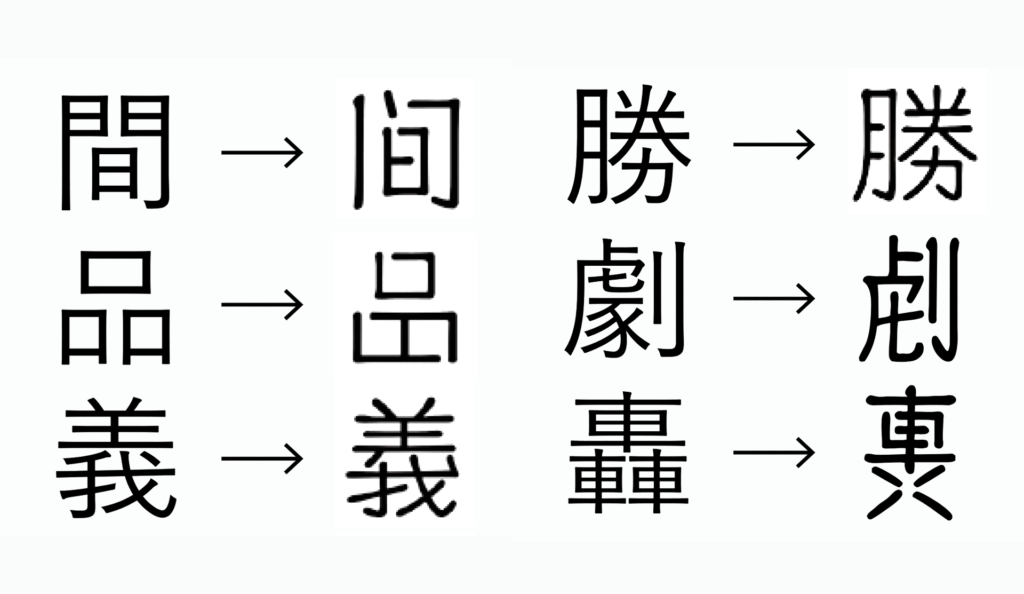
The use of ryakuji was entirely up to the title writer, and as was usual with Sato, he took care to make abbreviations that would not draw undue attention to the characters themselves. Some ryakuji, such as the shorthand versions of 間 and 品, had already existed before their use in subtitles and were considered conventional. Many more however were unique to subtitles, and contained changes that were more subtle and uncommon. These characters are controversial, and film studios have on occasion received letters from audiences complaining about them. These kinds of ryakuji, like the abbreviated forms of 義 and 勝, were an unavoidable response to yet another technical challenge: positive filmstrips.
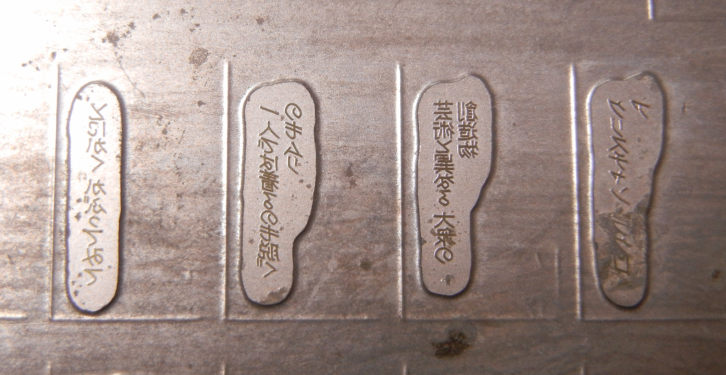
When foreign filmstrips were delivered to Sato for subtitling, they arrived as either fully-developed positives, or yet-to-be developed negatives. American films received in the post-war period in particular arrived mostly as batch-delivered positives, but shifted more towards negatives in the 80s. Whether a filmstrip was developed or not affected how subtitles were produced. Subtitles for negative films, called ‘burned-in’ characters, were written on cards that were photographed and simply developed into filmstrip together. With positive films however, subtitles needed to be physically ‘punched’ out of the filmstrip’s emulsion. These were called ‘pachi-pachi’ characters, named after the crinkling sound of the film strip when removed with metal plates made from Sato’s handwriting.
Pachi-pachi characters contain ‘airholes’, a visual trait unique to subtitles wherein strokes for kanji characters were deliberately disconnected, as if to allow air to flow freely throughout the character. After being drawn, the subtitles were photographed. The photograph negative was then used to create a metal plate to be punched into the filmstrip. This alone was not enough to imprint the characters into the filmstrip, so an acid solution was applied to remove them entirely from the emulsion, while leaving the rest of the film intact. Airholes allowed the acid to freely flow through a character and remove spaces that are usually enclosed. Without the airholes, counterspaces would often not be removed from the filmstrip fully, and kanji would instead appear as solid silhouettes. Notably however, hiragana and katakana do not have airholes. This is because they are less complex, and the acid had less difficulty removing their relatively larger counterspaces.
When combined with the use of ryakuji, airholes contributed significantly to the unique appearance of cinema moji. Though these elements are controversial, they are what makes cinema moji ‘cinema moji’. One more component that was largely unique to Sato’s cinema moji was his manipulation of individual character alignments to make each subtitle feel more unified as a whole. Unlike latin characters, Japanese characters generally do not share aligned strokes, like the horizontals in the latin ‘t’ and ‘f’, or ‘P and R’. They also don’t adhere to an x-height or strict cap height. Japanese characters are set in squares, and many (mostly hiragana) do not reach the vertical cap of the square.
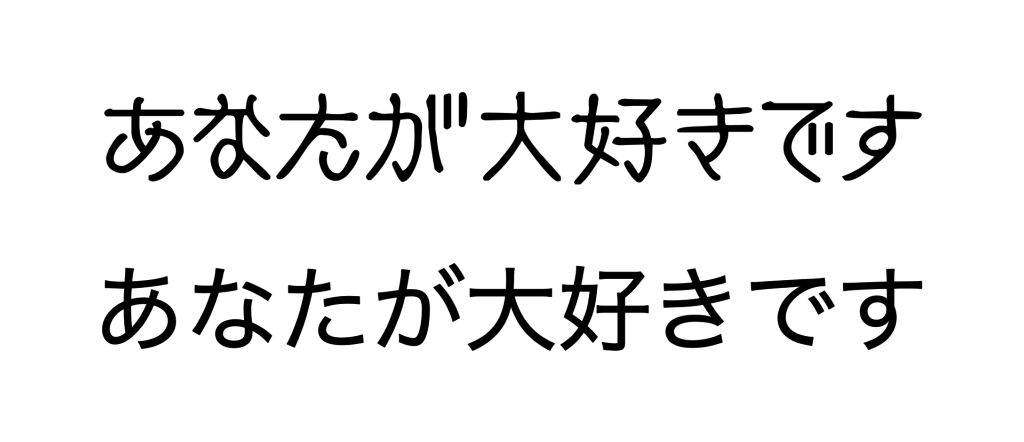
Sato’s lettering subverts these conventions, sacrificing contrast for visual harmony. His view was that with unified heights and stroke alignments, subtitles were more likely to be experienced as a unit, rather than a group of unusual characters. This was a strategy to distract audiences from the irregularities created by the use of ryakuji and airholes. Characters affected by this were mostly hiragana and katakana, but also included kanji where possible. We can see examples of aligned horizontal strokes in た け and ち, せ そ and ほ, and in compounds like ‘あなたが大好きです’. Among the characters affected by the shared vertical height are つ, へ, and こ.
In contemporary cinema moji, aligned strokes and vertical heights are elements that are sometimes overlooked, whether by design or mistake. Other characteristics that could be considered crucial to the genre are also often missing. This is partly due to design intent and commercial strategy, but is also the result of a lack of documentation on why subtitle lettering looked the way it did. Besides what was published by Sato, information on the visual characteristics of subtitle lettering is scant. This is compounded by the fact that many of the physical records of subtitle lettering no longer exist, and the craft is no longer practiced. Contemporary cinema moji fonts are largely based on handwritten subtitles that could be seen in theaters up until 2010, and more predominantly, Sato’s original Cinema Font. While Cinema Font was comprehensive, some characters that were historically important to the craft were not included, and are not represented in the current cinema moji landscape.
Lost Letters
Cinema moji fonts today are a reflection of what subtitles commonly looked like on screen when they were made by hand. However, there are several characteristics of the subtitle style that are not represented in contemporary cinema moji. One of these characteristics, the condensed lettering for CinemaScope and wide-angle projections, was never intended to be seen by audiences. Others, like the use of icons and expressive lettering were only seen by audiences in special circumstances. These elements were highly contextual. Few were included in Sato’s original Cinema Font, but are nonetheless historically significant to the style.
Many of the films that Sato subtitled in his early career were filmed in CinemaScope, a lens format that allowed films to be shot on 35mm film, but projected in widescreen. Specifically, a CinemaScope film appeared 2.55 times wider on screen than on its filmstrip. In order to produce subtitles that would appear properly on screen, Sato condensed his lettering proportionally so that it stretched to the ‘correct’ size when projected. He also reduced the weight of vertical strokes and decreased the spaces between each character, as these elements expanded on screen. Most of the subtitle cards that were drawn in this way have been destroyed, and few photographs of them remain. While never seen in its original form, this style of lettering became the style that was seen on screen. The cinema moji style as it exists now is in part the result of a calculated distortion of text, rather than a direct design.
Condensed characters were a hidden aspect of the production process, but the other group of lost characters were designed specifically to be seen. While subtitles were intended to be neutral and invisible, sometimes studios requested subtitles from Sato that were more expressive. These were rare cases where the role of subtitles shifted from simply conveying dialogue, to becoming part of the film themselves.
The most significant example of these kinds of cases was Harry Potter and the Chamber of Secrets, screened in Japan in 2002. Warner Bros. approached Sato and together discussed ways that the design of subtitles could enhance the experience of the film, for both localization and experience. Many of the spells and concepts in the Harry Potter series are based on Latin language and European mythology, elements that are less familiar to Japanese than English audiences. An English speaking viewer would understand that the spell ‘Crucio’ is not an English word, but would understand its general meaning. A Japanese viewer however, Warner Bros. and Sato thought, would not be able to make this distinction.
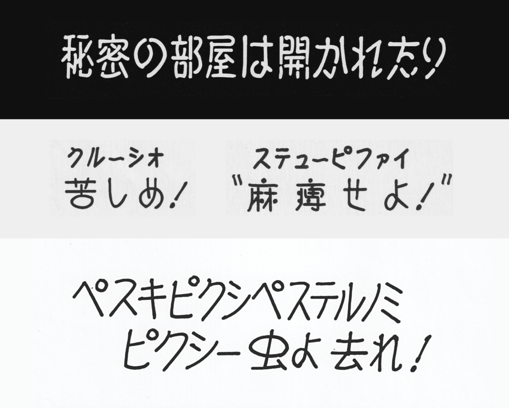
In order to make them more distinguishable, spells were written phonetically in ruby, and the main subtitle was written in a more descriptive Japanese equivalent. The spell ‘Cruicio’ for example used the phonetic ‘クルーシオ’ ruby, coupled with ‘苦しめ’, literally “suffer!” as the main title. This practice is not uncommon in regular Japanese text, but to enhance the distinction further Sato lettered spells in what he referred to as ‘spell characters’, a much rounder and more expressive style in comparison to his usual lettering. He also did this when characters speak ‘parseltongue’ (snake language), and during particularly menacing scenes. These ‘offensive characters’ were given extra airholes, making them appear broken and jagged. Sato usually received requests for this kind of lettering for genre movies, like horror and fantasy, but there are few samples besides the cards for Harry Potter that remain.
Beyond their entertainment and narrative value, Sato also used expressive lettering for accessibility. While he mostly wrote subtitles for foreign films, he also wrote captions for Japanese films for audiences who were younger or hard of hearing. These captions used in-line icons to help indicate situations like the sound of footsteps, knocking on a door, and the playing of music. Sato drew each icon by hand alongside his lettering. Although comparatively similar, Sato’s icons were developed independently to contemporary emoji, but were based more on the traditional use of illustrated text in manga and pop lettering, which Sato also had experience in. Some of these icons are available by request in the original version of Cinema Font, but otherwise were an aspect of Sato’s lettering that have not been represented in other cinema moji fonts.
Despite these elements of Sato’s lettering being absent from contemporary cinema moji, the genre today is still faithful to the spirit of his original work. This is in no small part due to the efforts of his son Takeshi, who engineered the first cinema moji font, Cinema Font, from his father’s lettering.
Cinema Font
Cinema Font is in part the legacy of Sato’s work as a title writer, but was also the pioneering entry in the genre that would become cinema moji. It was first engineered by Sato’s son Takeshi to give his father an advantage as his craft began to become obsolete, but would become a staple in the Japanese type landscape for its unique feeling of Showa-era nostalgia and ability to add a cinematic quality to whatever it was applied to. Although still in use, Cinema Font has been succeeded by Fontwork’s New Cinema, an expanded pair of fonts based on both Takeshi’s font and the lettering of his father. Today, Cinema Font and New Cinema are not only reproductions of Sato’s lettering, but artifacts that represent the final stage of a style of Japanese writing that no longer has the opportunity to evolve.
In the late 80’s and early 90’s, demand for hand-drawn subtitles began to decrease as technology that allowed subtitles to apply subtitles digitally became cheaper and faster. Although Sato was working less, he was still sought after for his hand-lettering. Having experienced his style of lettering for decades, audiences had come to expect it. Studios were torn between the traditional subtitle style, and their cheaper and faster alternatives. Sato’s son Takeshi, at this point a computer engineer at Hitachi, saw this as an opportunity.
Despite having no experience with digital fonts, he thought that digitizing his father’s lettering would give Sato an advantage. Creating subtitles by hand was a process that usually took a week per film, but with a font it would only take a couple days. They would also be the only title writers to offer digitally set subtitles in the traditional style. Sato was initially reluctant, and grappled with the fact that by creating a font he would be undermining the need for not only his own handwriting, but the writing of current and future title writers. With time however, Takeshi convinced his father to proceed. Sato had known for years that the shift from handwritten subtitles could not be stopped, and Takeshi believed that creating a font was the best way to both record his father’s work and continue to make a living.
Cinema Font’s early development was slow, incremental, and challenging. There was little information available at the time on how to develop Japanese fonts, and Takeshi continuously ran into both technical and design issues. It is important to note that his initial goal was not to produce a font that could be sold commercially, but to deliver subtitles to studios in a way that was faster than if his father had hand-written them. He had to create the characters, typeset each subtitle card, then print and send them to the studios.
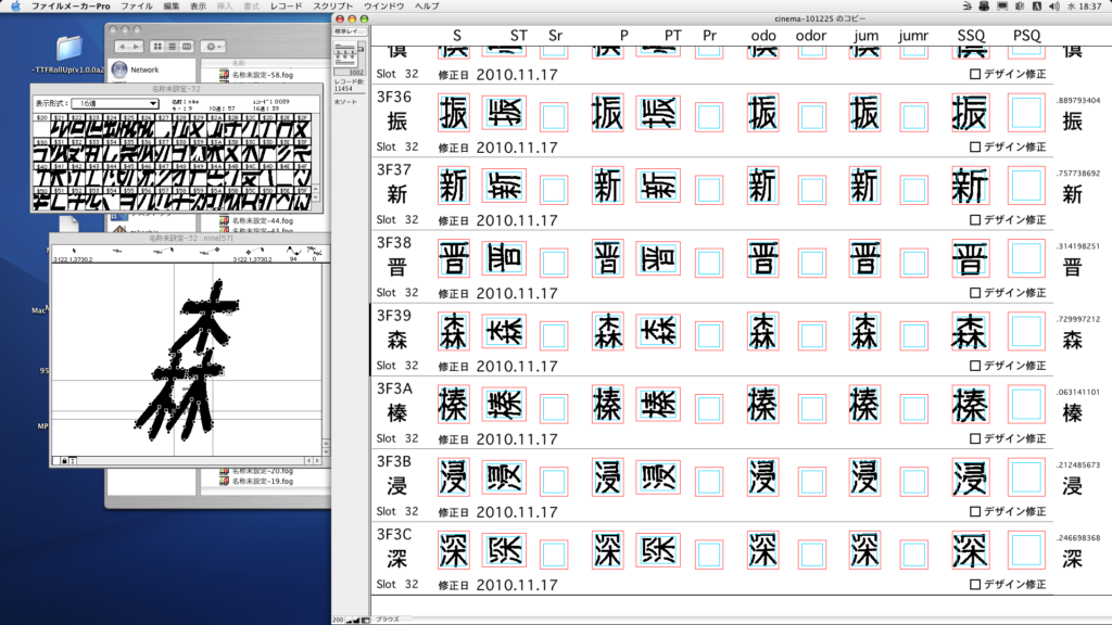
Takeshi drew the original versions of Cinema Font in Fontographer. At the time, Fontographer was not capable of producing double-byte fonts, only single-byte fonts. This meant that each font Takeshi produced was limited to 256 characters – vastly smaller than the thousands typically needed for Japanese fonts. When the fonts were ready, he composed the subtitle cards in a program called FileMaker Pro. The advantage of using FileMaker Pro was that it had an accessible GUI and was able to export and print the cards relatively quickly, but otherwise lacked features Takeshi needed, including the ability to perform any kind of kerning or sophisticated letter spacing.
The combination of being limited to single-byte fonts and using FileMaker Pro meant that Takeshi had to produce an inordinate number of individual font files. For every standard font, another was needed for the condensed characters used in CinemaScope. Takeshi also had to create two sets of italic characters. Italic characters are not typical in Japanese text, and the use of mechanical italicisation is generally discouraged. In Japanese subtitles however, italics are used to represent sounds or voices off-screen, song lyrics, or indicate when a different language is being spoken. When subtitles are set horizontally, italicized characters lean to the right, but when set vertically characters lean to the left. This is so the slant of the text matches the reading direction – horizontal Japanese text is read left to right, but vertical text right to left. Takeshi had to create character sets for both styles, in standard width and condensed.
When typesetting the cards, FileMaker Pro’s lack of kerning and letter-spacing functionality added to the complexity of the project. In order to kern characters, space had to be added to the characters in the font file, meaning that there often needed to be duplicate fonts with different degrees of added space, depending on which characters they would be sitting next to when typeset. This also made aligning the titles more difficult; subtitles were always center-aligned when set horizontally, and Sato had focussed on the ‘visual center’ of the text when writing, rather than relying on a mechanical measurement. The spaces added to each character had to be fine-tuned to prevent each line of text from being pushed too far to the left or right.
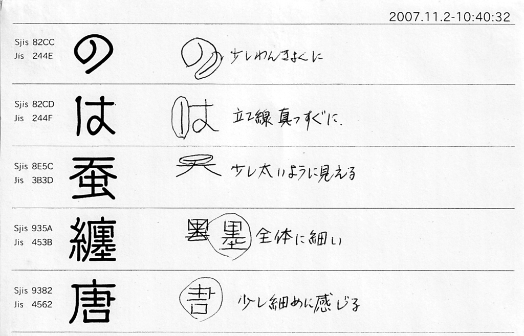
Alignment was also a persistent issue in the design of the characters. When done by hand, Sato wrote his characters to suit the other characters around them, always making small adjustments to their balance and weight on an individual, contextual basis. For example, the stroke alignment in the characters in the word ‘大丈夫’ were always made to match, but when those characters appeared in other words the alignment would be different depending on the other characters. This level of customization was impossible to reproduce for a font, and required testing a huge number of potential pairings. To get an idea of which pairings were working and which weren’t, Takeshi often printed out pages of variations, showed them to family members, and asked which they thought looked the best.
Due to these challenges, the production of the initial version of Cinema Font took years. The first version to be used in a film was for The Mark of Zorro, in 1998. Sato continued to write subtitles by hand in some capacity, and Takeshi would convert new characters as they were drawn. As interest in the font grew, Takeshi left his job in the early 2000s and started engineering Cinema Font full-time. He eventually shifted from drawing the characters in Fontographer to Adobe Illustrator, and used a program by Japanese company N4 Media that allowed him to export Cinema Font in double-byte, reducing his workload substantially. The first commercial version of the font was originally self-published through Sato’s own company, Advanced Media Laboratory, but was also repackaged and resold through other sellers as Cinema VF.
In the mid-2000’s, Fontworks began working with Sato on an updated version of Cinema Font. This new version, New Cinema, featured almost identical character shapes, but was significantly smoother than the original. When Takeshi had first started Cinema Font a decade prior, he had aimed to copy his father’s lettering as accurately as possible, retaining the rough edges and imperfections of the original lettering. After the release of New Cinema, Takeshi spent several years slowly updating Cinema Font to have a cleaner appearance, and the two fonts are now close to indistinguishable. The original, rougher Cinema Font is no longer available publicly, but still exists and the original is kept by Takeshi as a kind of family treasure.
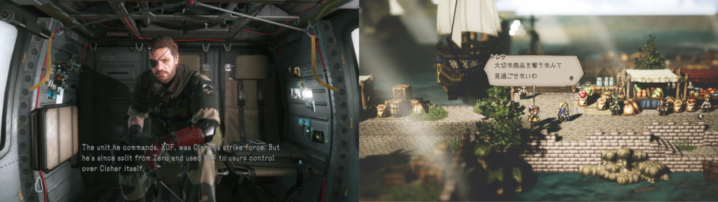
New Cinema has become the de facto version of Cinema Font visually, but the original is still in use, particularly in theaters. Studios will still use Cinema Font for subtitles because the way it is kerned is specifically useful for theatrical subtitle typesetting. New Cinema on the other hand is used primarily outside of film, for situations where a cinematic quality or feeling of nostalgia is needed. Often it is used for its cultural connotations of ‘film’. Video games like Metal Gear Solid 5, by Kojima Hideo, use New Cinema specifically because of its relationship to film. Advertisements frequently use New Cinema and other cinema moji fonts for captions because of their familiarity with audiences.
The introduction of Cinema Font pioneered a genre of type that may not exist without its defining entry. More meaningfully however is that Cinema Font and New Cinema, as reproductions of Sato’s lettering, represent the final natural form of the style. The subtitle style was formed by and responded to both the cultural conditions in which it arose, and the technological restraints imposed upon it. Now, cinema moji exist outside of those contexts, and the craft of title writing is no longer practiced, except by a handful of hobbyists and former professionals. Despite this, the connection that Japanese audiences feel with the style ensures that cinema moji have a future, and Cinema Font and New Cinema can serve as a foundation for new, evolved styles to emerge.
Conclusion
Whenever I see a film in a theater, I look forward to the opportunity to see Cinema Font, the culmination of over eighty years of craft, used in the environment it was designed for. It is humbling to know that something so seemingly mundane (deliberately so) is still valued by studios and their audiences. Outside of theaters though, I see styles of cinema moji that are new to me, and I’m just as happy to see the genre growing beyond its former life.
There are lessons we can learn from the survival of cinema moji. The subtitle style has endured because of the cultural connections that Japanese have with it, but we should also acknowledge those who worked to keep it alive. The efforts of the Sato family were crucial, but there are many others who contributed to cinema moji and the subtitle style who were never credited for their work, and have been forgotten.
Some of those people were crucial to this essay. Hashimoto Kyoko, a title writer who worked in the same era as Sato, still hosts a very old website with her own handwritten samples and information about the title writing process, that would otherwise have been inaccessible. Shibuya Nobuko, one of the last and still living title writers, has written online about her process. Up until recently, she taught her craft at a community center in Ikebukuro, and has provided her lettering for books, providing some of the only contemporary samples of the style in practice.
Through understanding the history of cinema moji and the life and work of Sato, I’ve come to appreciate the value of things we often take for granted. Too often as designers we fail to closely examine the less visible, less glamorous aspects of our history, and our culture is poorer for it. If we take a closer look at the people and work outside of our traditional understanding, we can work towards building a more honest, more inclusive culture of design.
Dan Vaughan
Dan Vaughan is a designer and sometimes writer from Australia working in Tokyo looking at things closely and living slowly.
“Thanks to Ian Lynam and Ray Masaki for their advice and feedback, and to Duncan Brotherton and Typographics T, without whom this article would not have been possible. A very special thanks to Takeshi and Akiko Sato who generously contributed images, information, and their time.“